
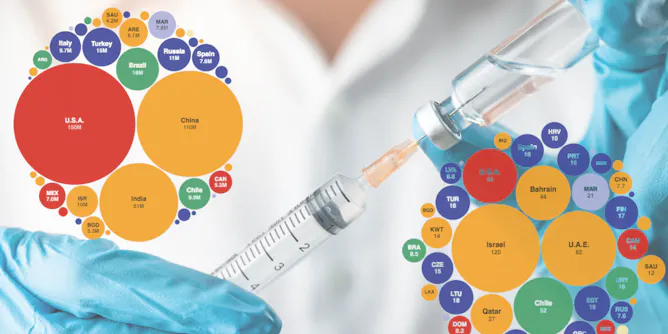
At first glance, Australia looks to be tracking poorly compared to the rest of the world. However, context is really important here.
Articles on Data visualization
Displaying all articles
Visualizations can help you understand data better – but they can also confuse or mislead. Here, some tips on what to watch out for.

Even though the Holocaust is one of the best documented genocides in history, there’s limited quantitative data available. A new study investigates the number of deaths per day.

A meteorologist and a music technologist team up to turn the data from tropical storms into musical graphs.
Can open data change the world? We looked beyond the hype to find out.

Catalog data are a library’s most important map to knowledge. What does it mean that
the Library of Congress just released 25 million records to the public?
Top contributors
-

Professor of Music Technology, Penn State
-
Lead Copyright Officer, Librarian, University of Michigan
-
Co-Founder of The Data Tank and Co-Founder and Chief Research and Development Officer of the Governance Laboratory (GovLab), New York University
-
Professor of Meteorology, Penn State
-
Associate Professor, Epidemiology, Deakin University
-
Professor of Biomathematics, RMIT University
-
Research Associate, Natural Hazards Center, University of Colorado Boulder